Analytics
Learn how to use analytics to gauge your team's performance and improve your report resolution rate.
System Overview
The analytics system provides comprehensive insights into your report data, helping you track performance, identify trends, and optimize your response processes.
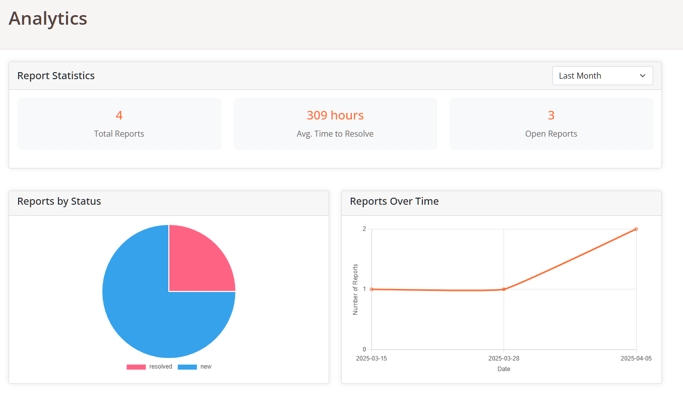
Analytics dashboard overview
Analytics Dashboard
The analytics dashboard provides a visual representation of your reporting data, allowing you to:
- Track Report Volume: Monitor the number of reports over time
- Measure Response Efficiency: View average resolution times
- Monitor Report Status: See the distribution of reports by status
- Identify Trends: Spot patterns in reporting frequency
- Filter by Timeframe: Adjust the date range to focus on specific periods
Understanding Charts
The analytics dashboard includes several key visualizations:
Status Distribution Chart
This pie chart shows the proportion of reports in each status category (New, Pending, Resolved, etc.), helping you understand your current workload distribution.
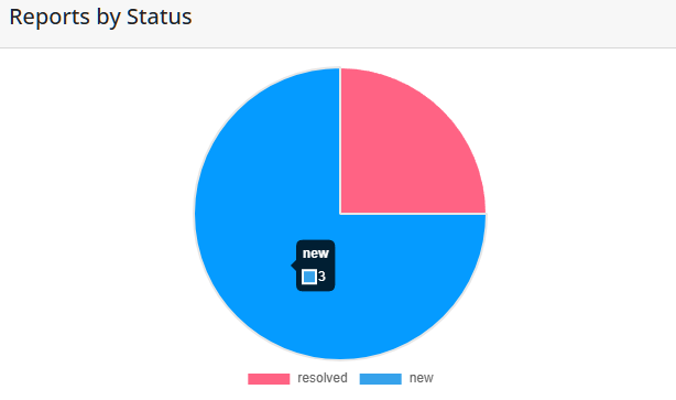
Report status distribution chart
Timeline Chart
This line chart displays the number of reports received over time, allowing you to identify patterns, peaks in activity, and track the impact of your initiatives.
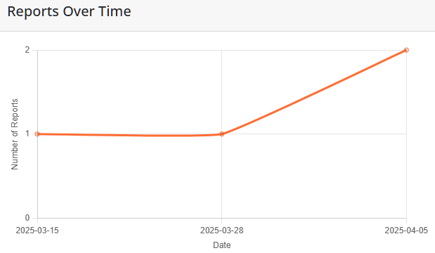
Report timeline chart
Key Statistics
The dashboard highlights several important metrics:
- Total Reports: The total number of reports received during the selected timeframe
- Average Resolution Time: The average time taken to resolve reports, helping you gauge team efficiency
- Open Reports: The number of reports that still require attention
These metrics provide a quick overview of your current status and performance, allowing you to set goals and track improvements over time.
Adjusting Timeframes
You can customize the data displayed by adjusting the time period:
- Use the date range selector to view data for different periods (7 days, 30 days, etc.)
- Compare current performance with previous periods
- Focus on specific time ranges to analyze the impact of particular events or initiatives
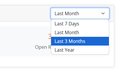
Date range selector for filtering analytics data
Interpreting Data
Effectively using analytics data can help improve your reporting system:
Identifying Patterns
Look for patterns in the timeline data to identify:
- Days or times with higher reporting volumes
- Seasonal trends or cycles
- Unusual spikes that may require investigation
Improving Response Times
Use the average resolution time metric to:
- Set performance goals for your team
- Track improvements over time
- Identify when additional resources may be needed
Status Distribution Analysis
Analyze the status chart to ensure you're maintaining a healthy balance:
- A high proportion of "New" reports may indicate staffing issues
- Many "Pending" reports might suggest process bottlenecks
- Track the "Resolved" percentage to measure overall efficiency